Pages

16 April, 2014

WebDynpro Standard Interface, Syntax & Code Wizard

Hello Guys...

Hope you all doing good.. :)

Before going further of previous post I thought you guys should know about some important standard interface of Webdynpro and syntax for writing code. Don't worry its not too tough and there is something called CODE WIZARD that will generate your 70% to 90% your code. Its cool na  :)

So Here I have listed some standard interfaces. You just visit the link and find out their methods of that particular interface. And these method we are going to use in future post.

1. IF_WD_CONTEXT_ELEMENT 
2. IF_WD_CONTEXT_NODE
3. IF_WD_CONTEXT_NODE_INFO
4. IF_WD_WINDOW_MANAGER
5. IF_WD_MESSAGE_MANAGER
6. IF_WD_COMPONENT_USAGE
7. IF_WD_PORTAL_INTEGRATION
8. IF_WD_VIEW
9. IF_WD_WINDOW
10. IF_WD_CONTROLLER
11. IF_WD_COMPONENT
12. IF_WD_APPLICATION

The above interfaces are standard and you are going to use methods of those interfaces so it will good to you if you go to one by one in all interfaces and check out their methods.

Apart from interfaces there is some standard references in WebdynPro programming. And that should be follow these standard references. like

                                     New Webdynpro ( EHP4 onwards) | Old  WD (Netweaver 04, 05)
____________________|____________________________|________________________
Component Controller  | wd_comp_controller                      | wd_comp_controller
---------------------------|---------------------------------------- |-----------------------------
 Node                          | lo_nd_(node_name)                       | node_(node_name)
-------------------------- |---------------------------------------- |-----------------------------
Element                        | lo_el_(node_name)                        | elem_(node_name)
---------------------------|------------------------------ ----------|-----------------------------
Work Area                  | ls_(node_name)                             | stru_(node_name)
--------------------------|-----------------------------------------|------------------------------
Internal Table              | lt_(node_name)                              | it_(node_name)
____________________|______________________________ |_______________________


Syntax For

1. Node Declaration
    Data lo_nd_(node_name) Type Ref To IF_WD_CONTEXT_NODE.

2. Element Declaration
    Data lo_el_(node_name) Type Ref To IF_WD_CONTEXT_ELEMENT.

3. Work Area Declaration
    Data ls_(node_name) Type  wd_this->element_(node_name).

4. Internal Table Declaration 
    Data lt_(node_name) Type wd_this->elements_(node_name).

5. Get Node Reference
    lo_nd_(node_name) = wd_context->get_child_node(name = '(NODE_NAME)' ).

6. Get Element Reference 
    lo_el_(node_name) = lo_nd_(node_name)->get_element( ).

7. Get the record into work area
    lo_el_(node_name)->get_static_attributes( importing static_attributes = ls_(node_name) ).

8. Getting all record into internal table
    lo_nd_(node_name)->get_static_attributes_table(importing table = lt_(node_name) ).


Note: Change the (node_name) as your node name. For example If your node name is ITAB then
  lo_nd_(node_name) = lo_nd_itab
     

Code Wizard:
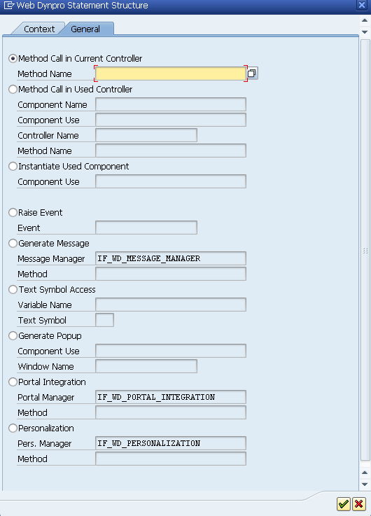
I was talking about code wizard. Through code wizard all the above syntax you can generate and even more. The below figure is about code wizard
The above figure is tool bar where you can find the Icon of Code Wizard is in red square by clicking you can open Code Wizard.
This is Code Wizard dialog box which contains two tabs Context and General.
Let see what are the options in Context Tab.

1. Node + Read = Get_Static_Attributes( ).
2. Node + Set = Set_Static_Attributes( ).
3. Node + Append = Bind_Structure( ).
4. Node + Read + As Table Operation = Get_Static_Attributes_Table( ).
5. Node + Set + As Table Operation = Bind_Table( ).
6. Attribute + Read = Get_Attribute( ).
7. Attribute + Set = Set_Attribute( ).

Let see what are the options in General Tab.
As you can see in figure there are many options available.Like
1. Method Call in Current Controller --> To Trigger the method of same controller.
2. Method Call in Used Controller --> To Trigger the method of different component which are used in current controller
3. Instantiate Used Component --> To activate the used component like SALV_WD_TABLE in memory.
4. Generate Message --> To display message like success, warning, Error
5. Text Symbol Access --> To Access text message from Assistance Class.
6. Generate Popup --> To open popup window, To open external window, To open popup window of used component.
7. Portal Integration --> To implement portal integration functionalities.
8. Personalization --> To provide user specific settings for application.

To Know more about Code Wizard.


That's all. Hope you guys find helpful...

Thanks & Don't forget to comments.. : )


12 April, 2014

ContextualPanel & ViewUIContainer Elements

Hello Friends..

Today's post about one of the most important UI Elements i.e ViewUIContainer & ContextualPanel.

ViewUIContainer:
It acts like a subscreen area of view, where you can embed another view (view inside view). Suppose you want to insert more view in main view and it is possible through ViewUIContainer only. And more than this ViewUIContainer is used when you want embed the Interface View of another Component like SALV_WD_TABLE, WDR_SELECT_OPTIONS etc. Without ViewUIContainer you can't display the Interface View of other Component.
                        So, ViewUIContainer is something like that by which you can insert View inside View or embed the interface view of other component.

ContextualPanel:
ContextualPanel is used to generate separates section in Output. ContextualPanel can contain collection of other screen elements i.e in ContextualPanel you can insert other UI elements like Button, Text, Label etc. ContextualPanel is also used for Navigation.


To understand more lets do it practically....

The final output will be like below.


As you able to see above. There is one ContextualPanle on Left side where there Button UIs are inserted in ContextualPanel  Search, Edit and Update.
                           And on Right side there is one ViewUIContainer in which three views are inserted at design time. The ViewUIContainer will display the one view at time on browser when you click on any button, here each view has different layout
And the both ContextaulPanel and ViewUIContainer UI elements is inserted in one MAIN View only.

Follow the below steps
Step1 : Go to SE80 and create a Component with one window W_Main and one view V_Main.
Step2: Create three more views says View1, View2, View3 with one Inbound plug for each view says IN1, IN2, IN3 respectively.
Step3: Go to View V_Main Outbound Plugs Tab and create three outbound plug says out1, out2, out3 like below. The final component will look like this one

Step4: Now Go to Layout of V_Main and insert the Contextual Panel under the ROOTUIELEMENTCONTAINER and make sure that Layout Property of ROOTUIELEMENTCONTAINER is Matrix Layout

Follow the below steps to create ContextualPanel;
1. Right Click Root UI Element Container -> Insert
   ID: Contxtpnl
   Typ : ContextualPanel
2: Right Click ContextualPanel(Contxtpnl) -> Insert
   ID: FreeConx1
   Typ : Free Contextual Area
3. Right Click Free Contextual Area(FreeConx1) -> Insert
   ID : But1
   Typ : Button 
Assign below property for Button (But1)
    Text: Search
    OnAction: Search and assign the outbound plug OUT1 as below

4: Right Click ContextualPanel(Contxtpnl) -> Insert
   ID: FreeConx2
   Typ : Free Contextual Area
5. Right Click Free Contextual Area(FreeConx2) -> Insert
   ID : But2
   Typ : Button 
Assign below property for Button (But2)
    Text: Edit
    OnAction: Edit and assign the outbound plug OUT2 as above
6: Right Click ContextualPanel(Contxtpnl) -> Insert
   ID: FreeConx3
   Typ : Free Contextual Area
7. Right Click Free Contextual Area(FreeConx3) -> Insert
   ID : But3
   Typ : Button 
Assign below property for Button (But3)
    Text: Update
    OnAction: Update and assign the outbound plug OUT3 as above
8: Right Click Root UI Element Container - > Insert
    ID: Viewcont
    Typ: ViewUIContainer
    and assign the below property for ViewUIContainer(ViewCont)
      Layout: Matrix Data
      VAlign: TOP

The final Layout of view V_Main will be like this


Step4: Go to window W_Main and drag & drop View1, View2, and View3 inside the ViewUIContainer.  And create the Navigation link by drag & drop the Outbound Plug  into Inbound Plug. And the final Window look like this


Step5: Go to Each View View1, View2 & View3 Layout Tab and Insert the PageHeader UI element with appropriate titles.

Step6: Save and Activate the Component and Create an Applications. And Test it.


Hope you guys understood how to insert ContextualPanel & ViewUIContainer UI Element. In Next post we will see  how to fetch the data from database and edit and update the database. We will be continue from this post only. Since in this post we see only how to insert the ContextualPanel and ViewUIContainer.


Thanks & Don't forget to comments

16 March, 2014

Navigation between Views

Hello Guys..

Today's post about Navigation between views. Once you able to understand this post. Then I am sure that you able to create a navigation between views.

To enable the Navigation link between views. You have to use the INBOUND and OUTBOUND plugs. The screen to make you understand how Navigation link worked.

As you can see that each view has plugs IN and OUT. To navigate from one view to another, each OUTBOUND plug from the view 1 must be linked with an INBOUND plug of the view 2 with the help of a navigation link.

INBOUND Plug:
The INBOUND plug defines the start point of the view. It handles the incoming from the other view into its view. An event handler method will be created at the time of creation of INBOUND plug in which you can handle the incoming to the view. When the INBOUND plug of this view is called by the OUTBOUND plug of the another view this event handler method gets triggered first.

OUTBOUND Plug:
OUTBOUND plug is used to call its subsequent views. Whenever a OUTBOUND plug is trigger it call the INBOUND plug of the other view to which the navigation link is created for.


So lets do it practically.
Objective: Create a component with two views in window and establish the link between views using plugs.

Step1. Go to Object Navigator using Tcode SE80 to create Webdynpro Component.
Step2. Create a Webdynpro Component, say ZWD_LINK (By default one window and one view will be
created)

Step3. Create one more View, Say VIEW2, Right click on View Controller and select Create


Provide the of View in View field and Description(optional) and press the enter key. And Save the component. Now in your component there is One Window( ZWD_LINK) and two views (MAIN & View2). As you can see in belows screen.

Step4.  Now go to MAIN View and click on Inbound Plugs Tab to create an Inbound Plug, Say IN1


To create an outbound plug, Click on Outbound Plugs Tab, say OUT1


Till Now we have created one inbound plug and one outbound plug in MAIN View.
In Similar manner, Create one Inbound plug(say IN2 ) and outbound plug (OUT2) in VIEW2 View.

Step5. Go to Window, ZWD_LINK and place the VIEW2 in window controller by drag and drop. Then your window structure will look like this

Step6. Now we have establish the link between these two views. We can do this simply this way
Select the IN1 of MAIN View and drag and drop on OUT2 of VIEW2. One pop up window will be open and press the enter key.


Similarly select the IN2 of VIEW2 and drag & drop on OUT1 of MAIN View.
Then your window structure will look like this.

Step7. Now go to MAIN View Layout and create an Button and provide the following properties of
                                 Text : Next
                                 OnAction Event: Next                    

Double click on onAction NEXT property of Button UI A pop up window will be open. And substitute the outbound plug name as OUT1 in outbound plug filed and press the enter key.

Now if you double click on NEXT onAction Events. Then you will see the below code. Its generate automatic when we substitute the outbound plug in above steps. 

Note: To trigger the outbound plug use the belwo syntax
                      
                   wd_this->fire__plg( ).
                 
Step8. Similarly, Go to VIEW2 Layout and place the Button UI Element and provide the below properties of Button
                                                  Text : Back
                                                  onAction Event: Back
And substitute the outbound plug as OUT2.

Step9. Now save you component and Activate the component.
Step10. Create an Application and run your application. So you below to see the output. Click on Next Button then it show the Button of View2.


So that's it. Hope you guys able to understand the simple topic but mostly used in component. 

Thanks & don't forget to comment.

09 March, 2014

Context Node and Attribute Properties

Hi,

I hope you all guys have looked on different standard UI elements of Webdynpro. If not Click Here

Today's post about most important concept Context Node and Attributes properties.

First of all let me tell you about Node and Attributes.

Node is something where you store the records. In other way Its like an Internal Table as in simple ABAP. So if you want manipulate with data you need a store place like Internal Table in ABAP. So Node is place where you can store the data/records so you can manipulate the data as you requirements.

And Attributes is something like variable which can be different data types. And Attributes hold the value for variables. Its like variable as in simple ABAP.

So now lets come to its properties.

Node Properties


So you can see in the above fig. There are different types Node properties. I will try to clear all properties of Node.

1. Node Name: When ever you create a node you have define Node Name. And its mandatory since in world every thing has name so Node as.

2. Interface Node: There are two possible value for this properties i.e "Yes" or "No". This properties of Node tells that you want make node as Interface. If you have choose "Yes" then this placed in Interface Controller so this node can be used in other Component as well.

3. Input Element (Ext): Through this property you can decide whether the new node should be available for an external mapping or not.

4. Dictionary Structure: If you want the fields / attributes from Table or Structure. Then give the name of that Table or Structure. And for adding the fields from Table Click on Button and select the required fields.
5.Cardinality: This properties is pair of values, which you can control the maximum and minimum number of elements at runtime i.e you can define the storage capacity of node as run time 
There are four possible values for Cardinality i.e
  • 0..1 : Node can store Minimum Zero Record or Maximum One Record at run time.
  • 1..1: Node can store exactly one record.
  • 0..N: Node can store Minimum Zero or Maximum n Record at run time.
  • 1..N: Node can store Minimum One or Maximum n Record at run time. 
6. Selection: Its like Cardinality, but its controls the maximum and minimum number of elements that may be selected at any one time. For example you have used Table UI element and If you want to select one row of table then define Selection property as 0..1 and if you want select the more than one row then you have to define the Selection property as 0..N.
And the possible values for Selection.
  • 0..1: i.e maximum you can select only one element or its also possible zero elements.
  • 1..1: i.e you can select the exactly one element.
  • 0..N: i.e maximum n elements or zero element
  • 1..N: i.e maximum n elements or at least one element.
7. Init. Lead Selection: At run time one of element of node has special position i.e is called Init. Lead Selection. This property tells you that whether the lead selection should be set automatically as soon as required.  Two possible values "Yes" or "No". The default value is "Yes".

8. Singleton: If you have created Nested Node i.e Node inside Node i.e Parent Node or Child Node. If you select the Singleton property of Child Node as "Yes" then there will be only one initiated of lead selection of Parent Node. If you define as "No" then there will be more than one initiated of lead selection of Parent node.

7. Supply Function: Its is special type of Function as node level. It is combinations with Singleton Property. If you have define the Supply Function for child node then you can capture the selected header record from parent node. Supply Function will triggered automatically when "Node is Empty" or "When you change the lead selection of Parent Node".
                   When you define the Supply Function for child node just double click on supply function then you will be able to see code which generated automatically. Here you have to write the Select query as you requirements.

Node Attributes Properties

There are different properties of Attribute

1. Attribute Name: Define the attribute name
2. Type assignment: Possible values "Type" or "Ref To"
3. Type: Assign the data type of attributes like int, String, or Elements etc..
4. Read Only: Set as "Yes" if you want to make it as Read Only
5. Default Value: Define the default value for Attribute.
6.Input Help Mode: Here you can define Input Help Mode as design time for Attributes. The possible values are
  • Automatic: It will show the automatic Input help mode of Attributes if you choose DDIC data element 
  • Deactivated: If you don't want to Input help the select this option.
  • Dictionary Search Help: If you want to Input Help from DDIC then choose this option. Give Search Help Name in Determined Input Help field
  • Object Value Selector: If you want to use OVS search help then choose this option and give the OVS component which used WDR_OVS component in OVS Component Usage field. 
  • Freely Programed: If you want to display the Webdynpro Component as Input Help which used the Interface IWD_VALUE_HELP then choose this option and give the name in Input Help Componet Usage field.


So today's post all about Node and Attribute properties. And I hope you guys will understand the properties of Node and Attributes. And it will be more clear once you practice as much as can.


Thanks and Yes don't forget to comment. :)


02 March, 2014

Web Dynpro Standard UI's Elements

Hello Guys,
Hope you all doing good and me too :)

Todays post about the Standard UI elements of Webdynpro.

There is numbers of UI elements are avilable in Webdynpro for different purpose with their own properties. Here I am going to figure out the important UI elements and their mandatory properties that you have to provied when you used these UI elements. Apart from mandatory properties of UI elements there are other properties also which are optional.

So here are the some Important UI elements in Web Dynpro and thier mandatory properties.

  • Input Field : To display the input field and its mandatory property is Value. ( more )
  • Label: To display the label for text or input field and its properties are Text & LabelFor. (more)
  • TextView : To display the text and its mandatory property is Text. (more)
  • TextEdit :  To display the text in editable form and its property is Value. (more)
  • PageHeader : To display the Header and its property is Title. ( more )
  • Button : To place the button and its property are Text & onAction( ). (more)
  • Image : To insert the images and its property is Source. (more)
  • CheckBox : To display the Check boxes and its properties are Checked & onToggle( ). (more)
  • CheckBoxGroup:To display the check boxes as group and its properties are Text & onToggle( )(more)
  • DropDownByIndex : To insert the drop down by index functionlity and its properties are Text & onSelect( ).  (more)
  • DropDownByKey : To insert the drop down by key functionlity and its properties are Selected Key & onSelect( ).  (more)
  • RadioButtonGroupByIndex: To insert the radio button as group by index and its properties are Text & onSelect( ).  (more)
  • RadioButtonGroupByKey: To insert the radio button as group by key and its properties are Selected Key & onSelect( ). (more)
  • LinkToAction: To insert the link as action and its properties are Text & onAction( ). (more)
  • LinkToURL: To insert the URL and its properties are Text & Reference (more)
  • Table : To insert the table and its property is  DataSource (more)
  • ItemListBox : To insert the Item List Box and its properties are DataSource. (more)
  • BusinessGraphics: To insert the map and its properties are SeriesSource,  X-axis( Category) i.e Descriptions and Y-axis(SimpleSeries) i.e Value  (more)
  • Iframe: To display the files on the browser and its property is Source. (more)
  • ProgressIndicator: To insert the progress indicator bar and its property is PercentValue. (more)
  • Tree : To insert the tree and its property is DataSource. (more)
  • DateNavigator: To insert the calandor and its properties are FirstSelectedDate, LastSelectedDate, StartsWith,  SelectionMode. (more)
  • FileUpload : To upload the file from local machine and its properties are Data, FileName, MIMEType.  (more)
  • FileDownload : To download the file and its properties are FileName, Texts MIME Type. (more)
  • InteractiveForm: For dispaly Adobe Form and its properties are DataSource, TemplateSource, PDFSource. (more)
  • TimedTrigger: To insert the time delay and its property is Delay (more)
Other Screen Elements are


LayOuts in WebDynpro Screen Designing

There are different types of layouts availabel in WebDynpro such as


I have listed above all the UI elements and Layout with link. And I have it will be help you out to understand the UI elements.

In further post you will learn how to use these UI elements. 


Thanks and don't forget to comment

23 February, 2014

First Demo Component

Hi Guys.

Hope you guys doing well.

Last post was about Controllers. And I hope that you guys understood.

Today, You are going to create a simple Application in Webdynpro. :)


Objective: Display the "Hello World".

Yeah, Its right when ever we learn a new technology or language. We create a simple application or program i.e. "Hello World"

I am trying to make it simple as possible as i can.

In this application we will use the standard UI element "Text View". ( In coming post you will come to know more about UI elements) to display the text "Hello World" on browser.

So let's start

Step 1. Go to Object Navigator using the TCode SE80.


Then Object Navigator window will be open.

Step 2. Select the "Web Dynpro Comp./Intf" from the drop down as below fig.


Step 3. Give the Component name as you want. Here I have given  ZWD_DEMO_1 and then press the enter key. A message window will be open and click on YES button.


Step 4. The below popup window will open after clicking Yes Button in previous step. In this popup window you will see the like this.

    
Give the short description. Here by default one Window "ZWD_DEMO_1"  and one View "MAIN" will be also generated. If you want to rename then you can as I did below.


And Then press the enter key.

Step 5. Give the package name, where you want to save your component.


Step 6. If you have saved in Package then give the assign the Workbench Request. If you saved in temp folder then you will not ask for Workbench Request.

Now You can able to see the your component as below. 

Step 7. Now double click on View "V_MAIN" to go to View. And Then go to Layout Tab of View Controller.


Step 8. Now Right Click on "ROOTUIELEMENTCONTAINER" then select the "INSERT ELEMENT" then one popup window will be open.

Note: Make you sure that you are in edit mode. Other wise you will not able to insert element.


Step 9. Here Select the "TextView" from the drop down from TYP and provide the ID for the TextView UI Element.


Step 10. Provide the mandatory property "text" of TextView UI element as "Hello World" as below. And save the layout.


Then you will able to see the below layout.


Step 11. Now double click on window "W_MAIN" to make sure that view "V_MAIN" is placed in window or not.

Since In this demo there is only one view so by default it will be placed in window. And you will be see like below fig.


Step 11. Now Save your Component and Activate the Component.

Note: Make you sure that you have selected  your component "ZWD_DEMO_1" other wise when you will try to activate then you will get an error message like below.


Step 12. Till now you have create your WebDynpro Component. Now its time create the application since only application will be open in browser.

To create the Application. Right Click on Component then select Create then WebDynpro Application


Step 13. A popup window will be open. Provide the application name and short description and then press the enter key.


Step 14. Then you will be see the your application. Here you will notice that an URL for your application is generated automatically. Now Save your Application in Package or TEMP package as you wish.


Step 15. Now its time for testing the application. To test your application you do in two different manner.

  • First Copy the URL which one generated automatically and then go browser and paste the URL. Then you will be able to see your application.
  • Or follow the below steps as shown in the fig.


And Finally you will able to see the below output on browser.


Hope you guys able to create your first Component in WebDynpro.

If you want to suggest me then you are most welcome.

Thank You.


16 February, 2014

Controllers in WebDynpro

Controllers -- What they are???
Controllers are the one of the most essential concept of WebDynpro Component. Or You can say that Controllers are all in all of any WebDynpro Component. Without Controller you can't think about WebDynpro Component.
From below diagram hope you can understand the basic concept of Controller.

As you can see the diagram. A controller is something where you will implement the your logic as well there is data storage area to storage data which you will use in your implementations
So In more precise way.. 
Controllers are used to handle application functionality. Various controllers exist as part of the WebDynpro framework to handle different aspects of the flow logic and WebDynpro component functionality. Programming within controllers is done via methods that refer to data stored in the context (Hierarchical Data Tree) or attributes.
Controllers are essentially ABAP classes with predefined methods, attributes and events that handle the basic functionality required based on the controller type. 
Examples of the standard functionalities are:
  • Hook Methods
  • Event Handler Methods for Navigation and Action Events
  • Attributes for local Data.

Types of Controller:

There are different types of Controller in WebDynpro framework which are
  1. Component Controller
  2. Custom Controller
  3. Interface Controller
  4. View Controller
  5. Window Controller
Before going further to know more about the Controllers. Let us know something about different types of interfaces that are created at the time of component creations. These interfaces are as below.

IF_<ControllerName>
IG_<ControllerName>
IWCI_<ComponentName>

The interface begin with the prefix IF is local and can be used for coding only within that controller.

The interface begin with the prefix IG is used for Cross Controller Communication.(e.g Component controller to View Controller)

The interface begin with the prefix IWCI is used for Cross Component Communication.
(e.g. ComponentA to ComponentB )  Now lets come to the Controller types..


Component Controller

This is the parent controller for the WebDynpro component. There is only one Component Controller exists as per WebDynpro component and it is Global Controller. i.e Component Controller consist of data, flow logic, Events, Methods are available to all the other types of  controller.
                   This controller does not have any visual interface. The life time of the component controller is the life time of the component.

Components of Component controller:
  • Properties
The Properties tab consists of the description and the development attributes. It also has a Used Controllers/Components directory. If the controller needs to share data with another controller, it must be added to this list and thus declared explicitly.


  • Context
Context is a hierarchical form of storage of data. Context is a place where you declare the data. The Nodes declared here can be mapped to any no of view and can be accessed from there hence making the data of the component controller global.

Note: In Coming post you will be understand about Context and its properties.


  • Attributes 
The attributes required by the Component Controller are declared in the Attributes and are accessible to the methods of the Component Controller using the handle provided for the Component Controller (WD_THIS). The attribute WD_THIS declared in any controller refers to the interface of the current controller and the attribute WD_CONTEXT refers to the corresponding Context of the controller.
                These attributes can also be accessed from different controllers as well using the handle provided for the Component Controller (WD_COMP_CONTROLLER) in the respective controller.


  • Events
Events created in the Component Controller are visible only within the component which means it can only be triggered by the methods of the Component Controller. But it can be handled in different controllers. Thus Events are used to communicate between the controllers and enable one Controller to trigger the event and handler the event in different controller.
          Events can also implement Cross Component Communication provided that the  interface check  box  is checked.


  • Methods
Component Controller consist of number of predefined methods called Hook Methods which are executed in a pre-defined manner. You can also create your own methods and the methods which you created can be called from any Controller using the handle for the Component Controller (WD_COMP_CONTROLLER).

          Note:- In coming post you will come to know more about Hook Methods


Custom Controller

Custom Controllers can be additionally created in the component and there are exactly similar to the Component Controller in terms of functionality. This means it is visible to all the Controllers. And life time of the controller is the lifetime of the component.
                                     Any number of custom controller  you can create in the component and it will provide you the option of structuring the data’s and functions. It only make sense to create a custom controller if certain function and data’s are to be associated with the specific set of views.

Components of Custom Controller:

The Components of Custom Controller, Properties, Context, Attributes are similar to the Component Controller. And only Events and Methods are differ from Component Controller.
  • Events
 You can create Events and implement in a similar way to the Component Controller except that you cannot implement Cross Component Communication. It can be handled only within the component.


  • Methods
 Unlike Component Controller the Custom Controller does not contain a no of Hook Methods. There are only two Hook Methods are available (As you can see in below screen). You can create your own methods in the Custom Controller and these methods can be used by any views provided that the Custom Controller is added to the Used Controller/Components in the properties tab of the view.


Interface Controller 

Interface controller is used for Cross Component Communication. Interface controller itself does not contain any implementation. It is the point of contact of communication for other component to use this component. Only nodes, methods and events marked as interfaces can be used by other Components.
                      For the Interface Controller of a Web Dynpro Controller, the methods are implemented in the related component controller.
                       For the Interface Controller of a Component Interface definition, the implementation is performed in the Component Controller of the embedding component.

For every interface controller there is a related ABAP interface   IWCI_<component_name> or IWCI_<Comp.Interf.Def-Name>

Components of Interface Controller:
  • Properties:
In the Properties tab you will be able to see the administration data and ABAP Interface that              was created for the external communication (IWCI).


  • Context
In the context tab you will be able to see the context nodes of the Component Controller which is marked as interface node in the node properties of the Component Controller.


  • Events
In the events tab you will be able to see the events which are marked as interface events for Cross Component implementation.


  • Methods 
In the methods tab, you will be able to see the interface methods that can be accessed by the other components.


View Controller  

No of View Controllers in a component depends upon the no of views. The view controller cares about the view specific flow logic like checking user input, handling user actions etc & design the UI using standard UI's element. The lifetime of the view controller is restricted to the life time of the view.

Components of Interface Controller:
  • Properties:
The properties tab of the view controller consist of the admin data as well as the option to add the used controllers for the view.


As you can see in the above screen. A component ZWD_LINK is used in view controller so you can access the methods or context data from the view controller of Component Controller. This component will be added automatically when first time you create a component. And you have to add others component in Used Controllers/Component explicitly so you able to access the functionality of other Components.
  • Layout:

Layout is something which gives you feel as WYSIWYG (What You See Is What You Get). In you layout you will design the user interface using UI elements. As you can see in the below screen. Layout is divided in four parts.  
  • UI Elements Library (left hand side)
  • View Design Area (middle)
  • UI Element hierarchy (top of right hand side) 
  • UI Elements Properties (below of right hand side)

  • Inbound Plugs:
Plugs are required for the navigation between the views. You can create Inbound plugs here and Inbound plugs are also consist of event handler method which will be executed before displaying the view.
  

  •  Outbound Plugs:
Outbound plugs consist plugs which is pointing away from the view. This does not contain any event handler method and you can define the parameters for the plugs. The Outbound Plug can be fired using following syntax.

                                      WD_THIS->FIRE_<OutboundPlugname>_PLG( )


  • Context
Context in View Controller is same as Component Controller. You can create your Node in Context or you can use the context Node of Component Controller  using Context Mapping. After Context Mapping the Context Node value of Component Controller will be visible in View Controller.

View Controller Context is visible to the View only i.e you can not access from other controllers since View Controller doesn't allow to create interface Context.


  •  Attributes
Attributes is similar to that of the Attribute Tab as in the Component Controller. In the view controller you will be able to see the handler (WD_COMP_CONTROLLER) to the Component Controller with reference to the interface of the type IG_(Cross controller). Using this handler the attributes and methods of the component controller can be accessed.


  • Actions 
In Action Tab all the actions will be listed for which UI Element you have created the Action and also the event handler action will be listed.


  •  Methods
Methods Tab is similar as Component Controller. You will notice that all the Hook Methods specific to View Controller are listed apart from Hook Methods other Methods and Actions are also listed which you have created for the UI Elements.


Window Controller
Each window in a WebDynpro component consist of a window controller. It is visible throughout the component and behaves like Component or Custom Controller.

Components of Interface Controller:

  • Properties 
Properties tab of the Window Controller is similar to that of the View Controller.


  •  Window
In the window tab you will be able to see the views that are embedded in the window, inbound and outbound plug of each view and the view that is marked as default. Here you can also specify the navigation link between the views using the view plugs.

Note : Don't forget to embed the View in Window when ever you created a new View otherwise you will not able to see the view in browser.

  • Inbound Plugs
In Inbound Plugs Tab you will be able to see the one DEFAULT plug and you can define your own plugs also.

The properties of Inbound Plugs of Window is differ from Inbound Plugs of Window  as different characteristic like Interface Exit, Suspend . You can create the different types of Inbound Plugs here like Startup, Exit, Resume, Suspend as well.

The Interface Check Box determines whether the Inbound Plug is used only for navigation within the component or cross component navigation.
 
  • Outbound Plugs
Outbound Plugs consist of interfaces, Exit and Suspend characteristics. And you also define the parameters for Outbound Plugs.


  • Context
Window Controller can be used to implement navigation controls within the window. Typically you use it to create the data in the context that you require for navigation decisions. The context of a window controller is no different to the contexts of other global controllers; it can be viewed within the whole component


  • Attributes 
 You can maintain attributes for the context of a window.


  • Methods 
Methods Tab is similar to other  controllers. You will able to see the list of Hook Methods specific to Window Controller and apart from this the event handler for inbound plugs as well as for events of other controller, you can also create the simple methods for window controller as well.


That's all about Controller. Hope you will able to understand about controllers. In coming post you will be able to understand more about Hook Methods.


And Don't forget to comment  :) :)

Thanks